BigPay, SE Asia
Redesigning the verbal proposition and visual brand expression for a still-nascent digital banking fintech by elevating a social mission to bank the as-yet unbanked and be the dominant challenger banking provider for SE Asia.
Brand Idea
Brand Sprints
Visual Brand Design
UI Design
Manifesto Writing
Toolkit Writing & Design
Presentations


The existing mark and visual idea was somewhat generic and appeared ‘homemade’.

A simple and straightforward proposition for difference:

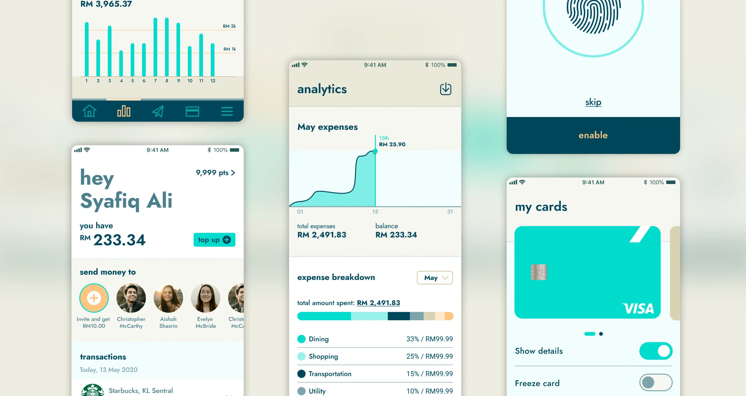
Revised and approved app UI concepts handed over to in-house product team.

Many small changes make a big cumulative difference


Thinking…

Working…

Conjuring…


A big breath here…
Guidelines for a big deployment