UOB (United Overseas Bank)
The UOB Brand was seen as strong, stable, relationship-based, trusted and perceived as strong across ASEAN; however, the transformation of UOB internally was not reflected in external perceptions of the brand.
Against this backdrop, we evolved the brand purpose and expression for customers now looking for a more progressive and relevant bank.
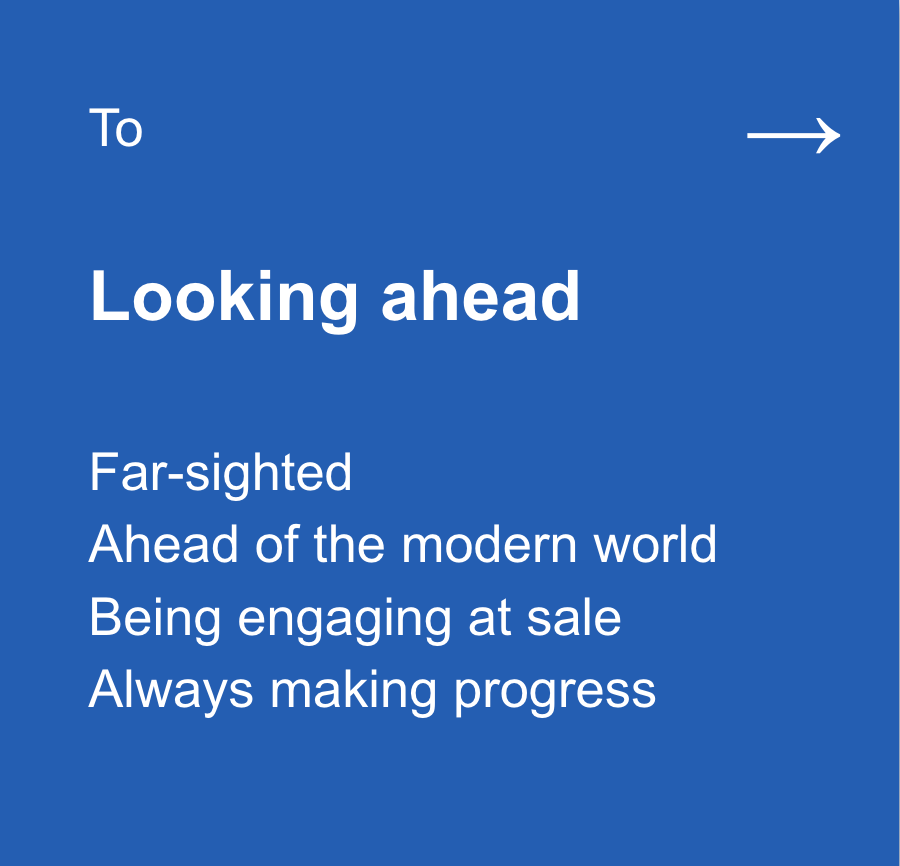
Brand idea
Brand framework
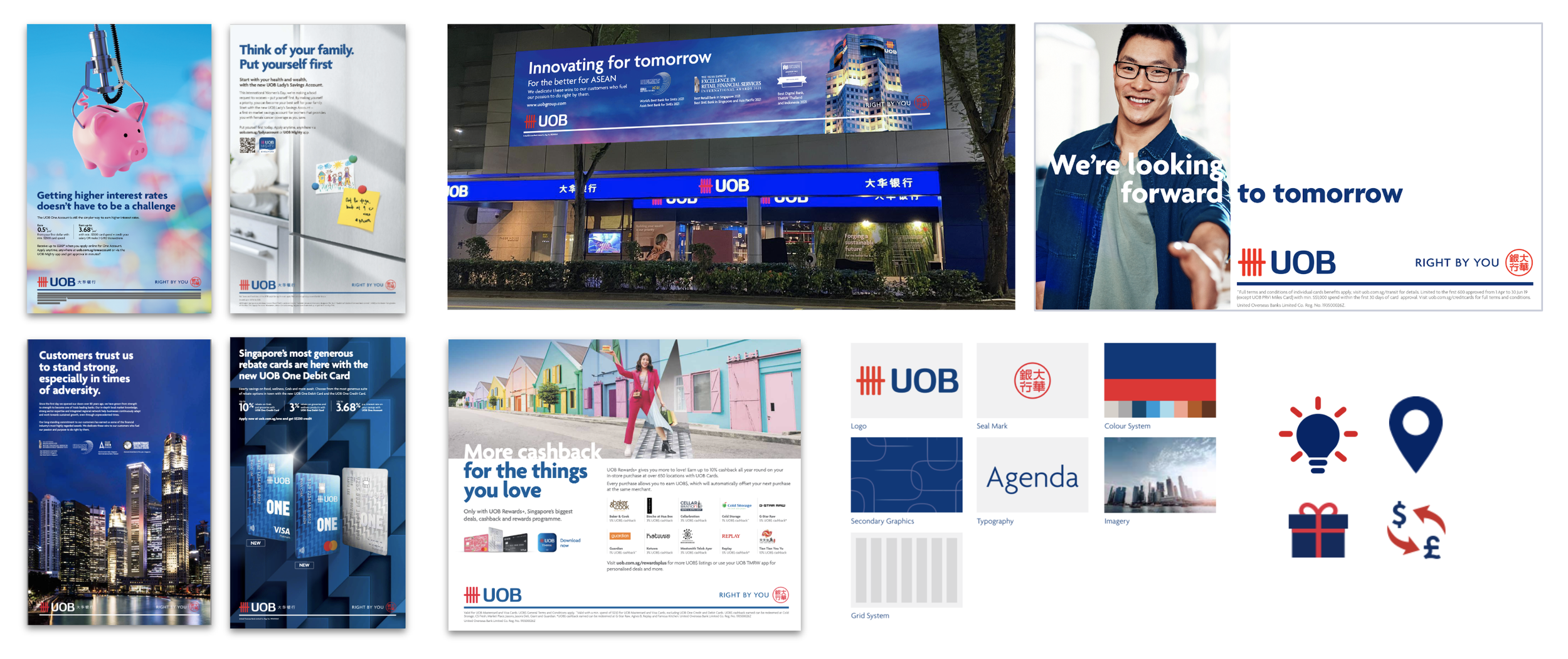
Visual brand design
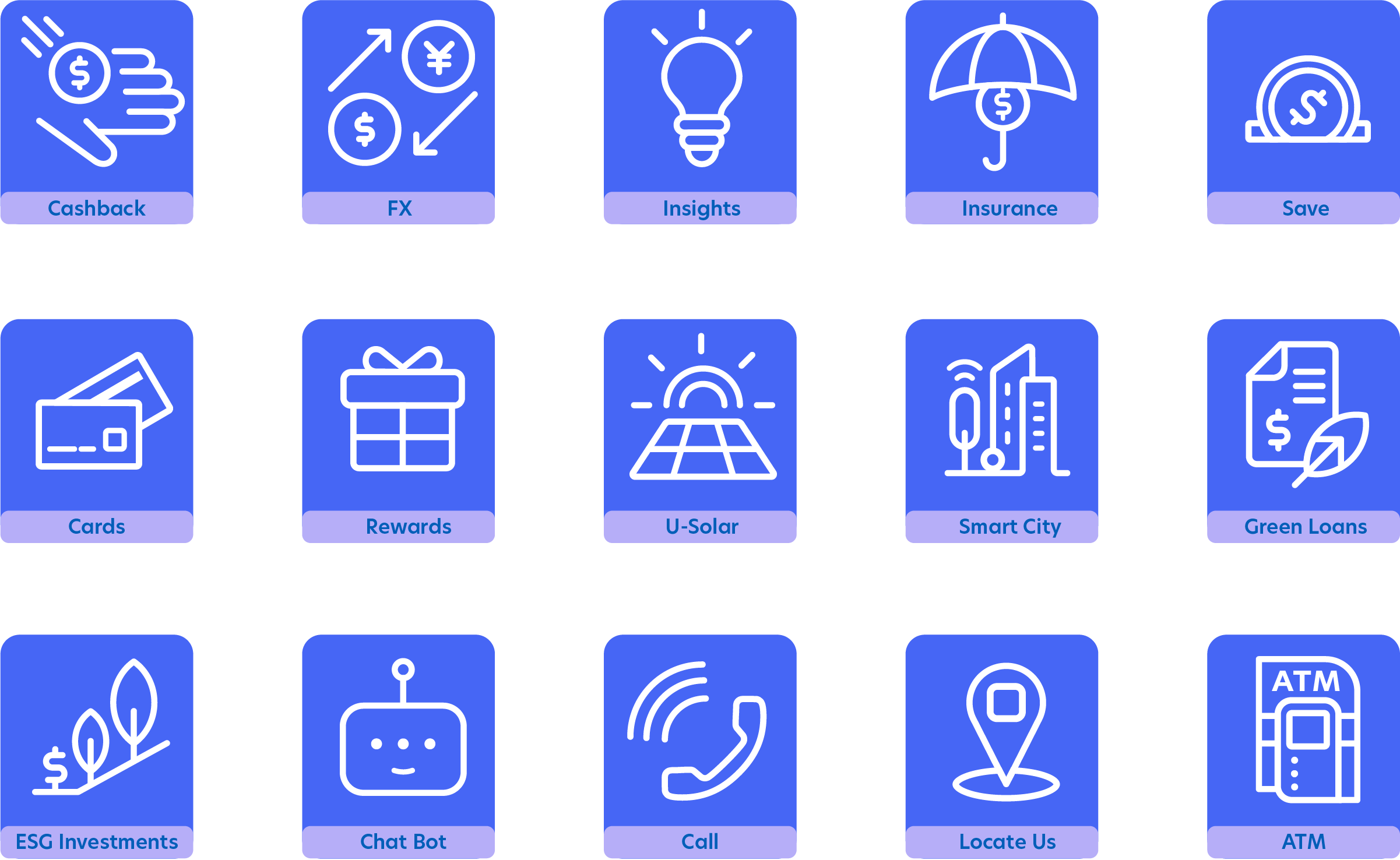
UX/UI design
Toolkit writing & design
Presentations
Stakeholder management
Guidelines
BEFORE:
The incumbent state of play was inconsistent and heavy-handed:


Improving external perceptions demanded
a wholesale strategic transformation first:

Many small changes compound to an overall big move on:
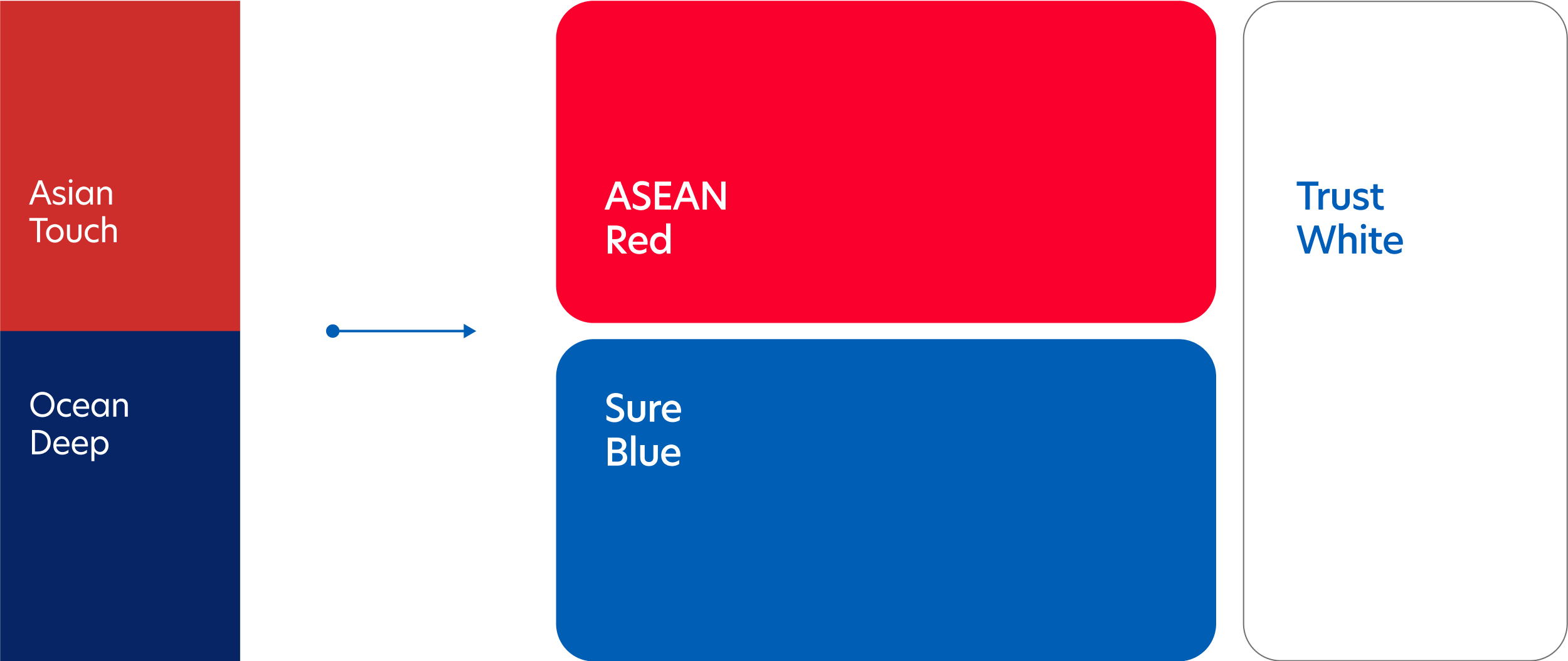


Secondary colours carry further strategic brand storytelling value,
particularly for internal stakeholders


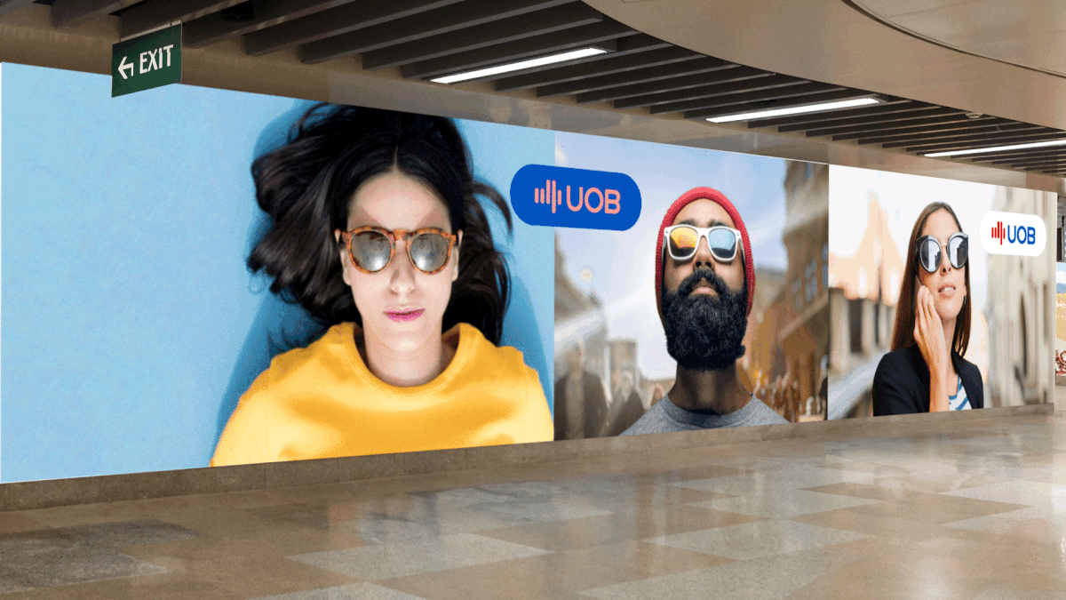
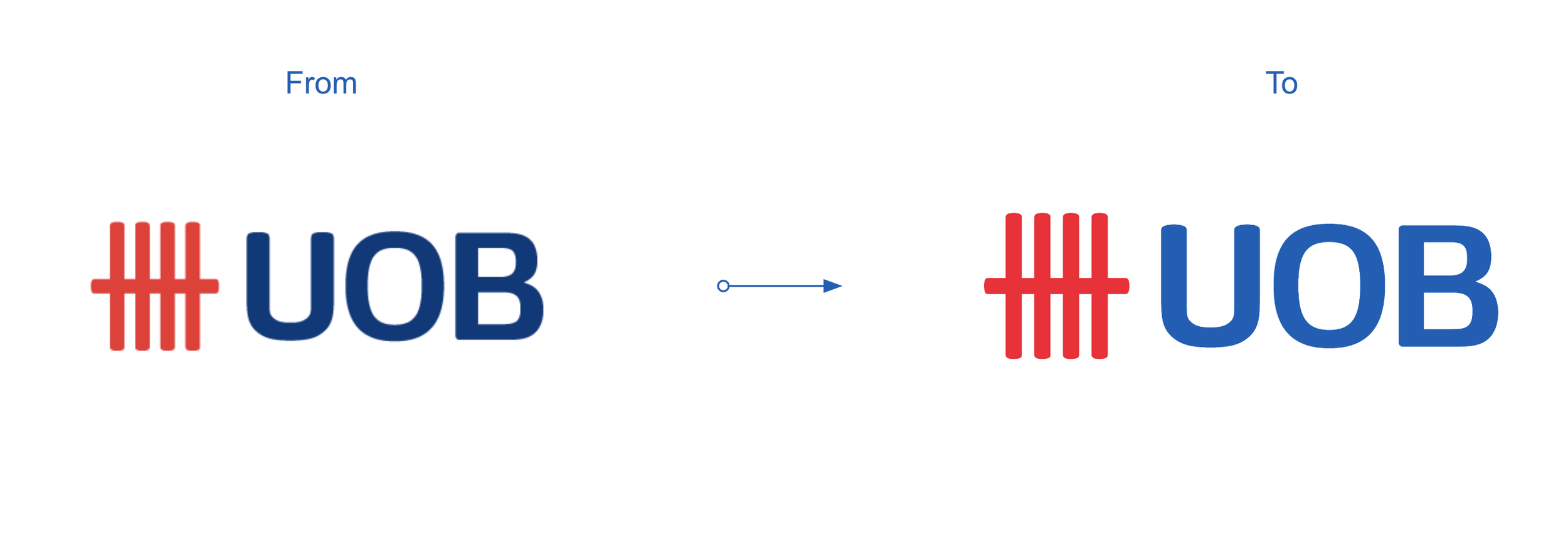
Moving the key visual grid and approach on:
Control logic for full implementation stretch across channels:


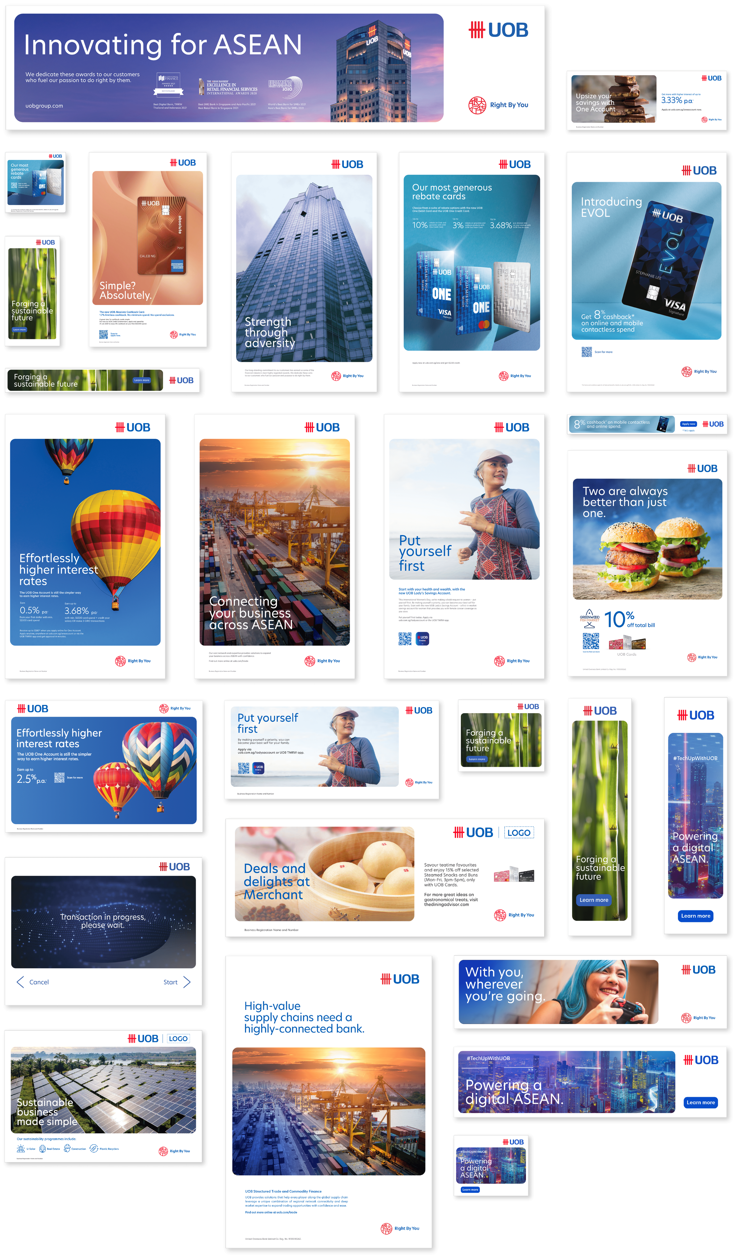

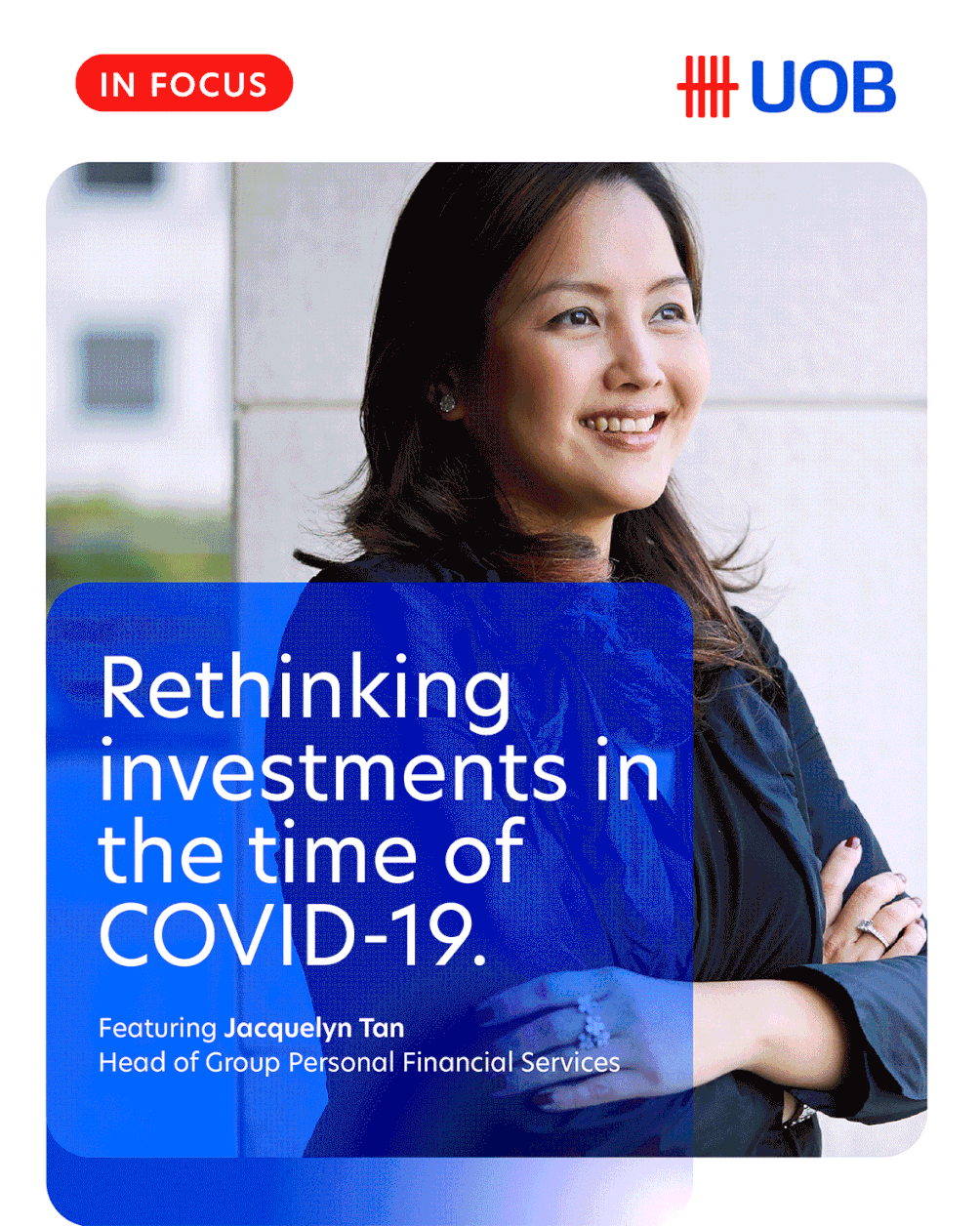
LinkedIn content takes on a new look:

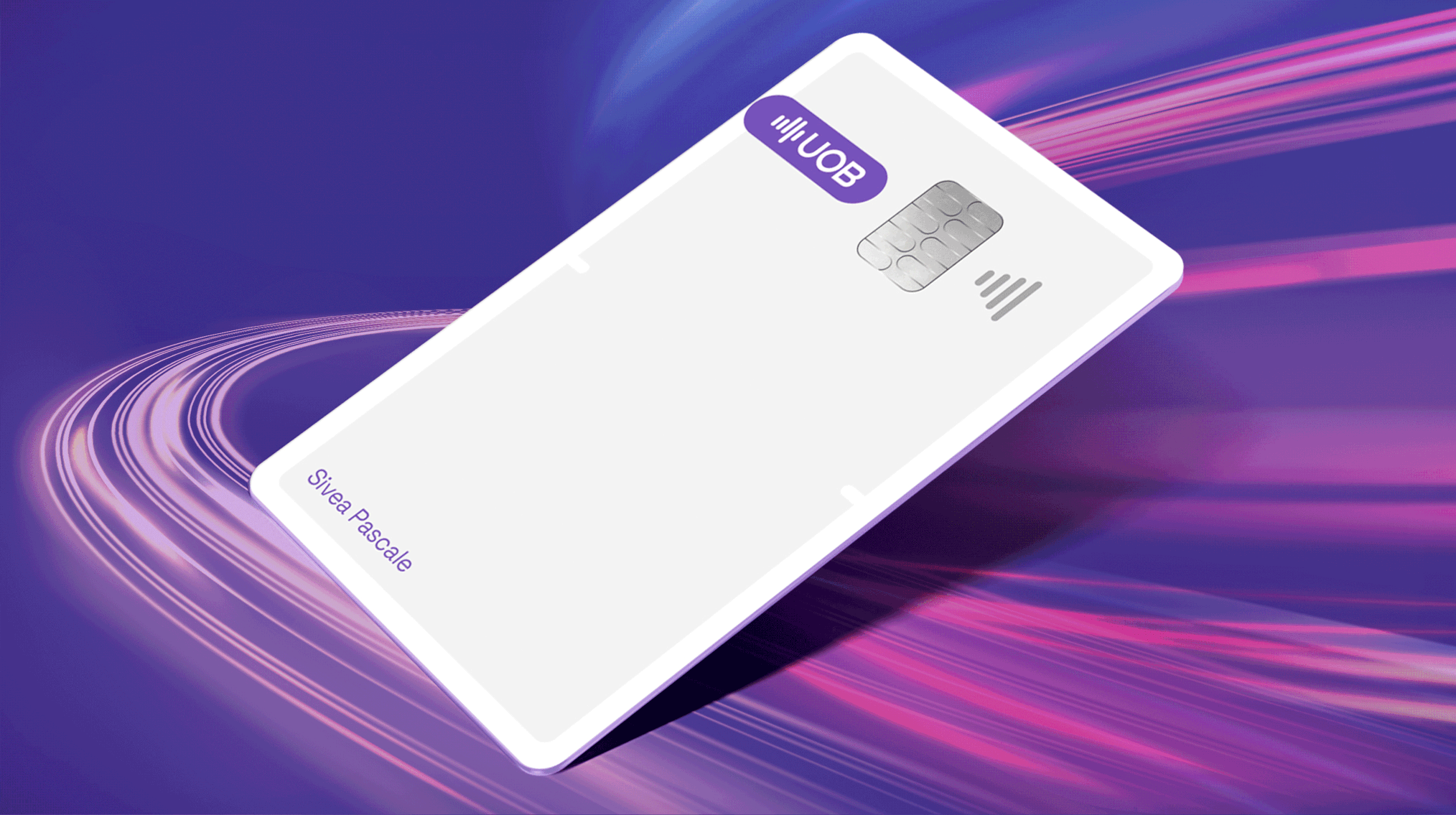
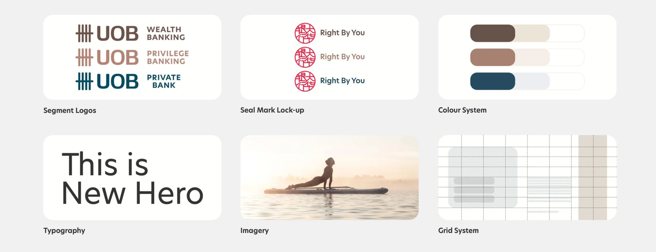
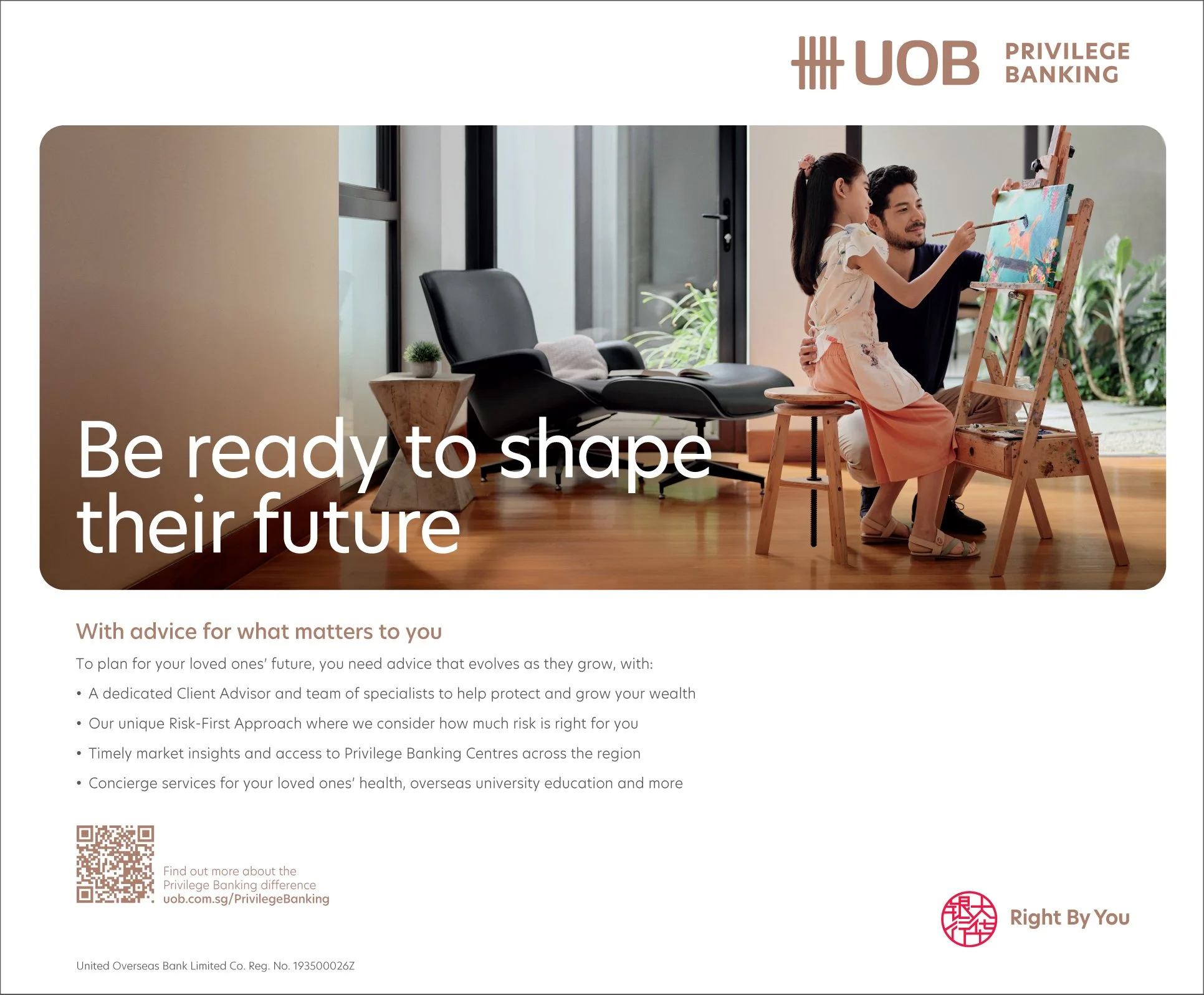
A dynamic masterbrand approach threaded through to premium banking products, deploying the self-same identity theory albeit with distinctive colour per respective segment:


The first redesign was more youthful and energetic but did not jibe with the organisational persona within
(although it won us the business as a vision for their future):